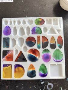
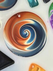
Claire Holoway from House of the White Rabbit has kindly written another blog that explains another of her amazing petri techniques. These cabochons are made with 1:1 epoxy resin and alcohol inks. They are just truly stunning!
Hi all. A lot of you ask me how I keep my in colours from muddying in my petri resin pendant cabochons. So, I thought I’d pull together some tutorial videos to show you how I achieve this. I am calling this ‘Lightning Technique’ – it’s completely original to me but I am happy to share. A shout out is always nice in your posts!!
We all know that there are some ink colours which muddy really easily. Usually they are the complimentary colours on the colour wheel, for example red and green, blue and orange, yellow and purple. There are two key parts to this Lightning colour separation process which will prevent these colours from muddying.
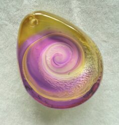
Firstly, you will require what I call a ‘splitter ink’. This is not a new kind of ink that anyone has manufactured; it’s what I term the very light pastel coloured ink that I use to separate my two main colours. For instance, in the Tim Holtz Ranger inks, I use Cool Peri, Salmon, Aqua, Cloudy Blue and Lemon Yellow in Limino. The splitter ink colour I use depends on the two main colours. For instance, where I am using purple and yellow, I would match it with Cool Peri as a splitter ink as it won’t overtake either colour and matches the purple. Another example would be to use salmon when creating pieces with blue and orange. For the same reason.
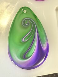
Secondly, you will need to learn how to place your ink’s within the cabochon. Virtually all petri work you will see demonstrated online presents the ink colours dropped at random. My placement is extremely specific. It is very important to place your inks at the edge of the cabochon and let them travel towards one another. The splitter ink goes in between the two main colours used and ONLY onto that do I drop the white sinker ink to create the petri effect. This creates a very thin “lightning bolt” line of petri – hence the name I have given to this particular technique.
For maximum effect, I usually pull light into dark or vice versa when swirling.
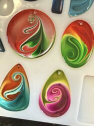
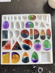
#2 Colour Separation (‘Lightning’) Technique in Petri – how to stop your ink colours muddying. Well……. #1 tutorial compilation has gone down a storm ….. here, on Insta and almost 20K hits here on Tik Tok in less than 4 days 😳😳 so we’re back for more!! Keep watching past the tutorials for live demolds, cabochon close ups and images of the cabs in their trays before swirling so you can see the ‘lightning’ effect. You guys asked for more information on kit and timings. I’ve also voiced over these mini tutorials here too. Enjoy the magical Dance of the Petri formation. This technique is completely original to me (House of the White Rabbit). As always, I’m happy to share – a shout out is always great to see if you use and post. Makes the effort of pulling posts like these together really worthwhile. Epoxy here is Teexpert Resin Pure Glossy 1:1. I am using Tim Holtz Ranger inks (including ‘splitter’ inks) and Limino White alcohol ink sinker. This time I have also used Tim Holtz metallic inks in Gilded (gold) and Sterling (silver). Epoxy is mixed and poured straight into the molds. As soon as all cabochons are filled I drop my inks straight away. Colours at the edges of the cab, splitter ink in between – with sinker ONLY on the splitter colour. Splitter inks used here are Tim Holtz Ranger Cool Peri, Salmon, Aqua and Sandal. You see the splitter ink with sinker push out and shrink back together – as it always does when Petri is formed. This shrinking process draws the two colours together without muddying them, creating a thin ‘lightning bolt’ line of sinker. Hence the name given to the process. When all inks are dropped, my 2 hour heat mat (usually medium or high) goes on and I swirl at 15-20 mins dependent on ambient temperature on the day. A lot of you ask how I create my swirls. Tbh it’s the only part of the process I keep just for me as it’s kind of a unique signature. But what I will tell you is that I pull light into dark or vice versa for maximum wow factor and usually finish directly under the bail hole as it visually balances the piece. I also practice a lot with pencil and paper. I also get asked if I content create. Well I do – here and on my other social media platforms. But I work full time, so detailed YT tutorials aren’t on the horizon atm. Hopefully in a year or two as I move into semi retirement. There’s a new complimentary colour combo you see here on the first oval. Stream and Sunset Orange, split with Salmon. It’s also a colourway demonstrated here. I am getting so many post hits now that Facebook are automatically putting ads in some content. Please know – if you see this, I’m not doing it myself, or for myself. As always, enjoy the Dance of the Petri. 🐇🐇🐇🐇🐇 #resin#resinart#claireholoway
#3 Lightning Technique – using ‘Splitter Inks’ as a colour in their own right. Hi all, thankyou for your wonderful ongoing support with the previous two tutorials on Lightning Technique. The response has been incredible. For those of you that’ve been following along, this is the original technique I have released which is virtually guaranteed to stop your colours muddying together when creating your resin Petri work. The term “splitter ink” does not refer to a new type of alcohol ink. It’s simply the name that I have given to the very light pastel coloured ink that I use to separate my two main colours, on which, and only on which, I put the white sinker ink; Lightning Technique. A lot of you have been asking me if you can use these very light pastel colours in their own right in rein. Of course the answer is that you can, so I thought I’d record you a few short demonstrations. The splitter inks used here are written in the photographs – Cool Peri, Cloudy Blue, Salmon, Sandal and Aqua. Apologies, in the last of the three demonstrations I refer to the light teal ink as being called Pool. It is in fact Aqua. In the demonstrations, you will see me using a splitter ink with a darker colour and also using two splitter colours together to create absolutely beautiful cabochons. I am NOT using Lightning Technique here (sinker only on the pastel splitter). I am adding the sinker to ALL of the colours on the cabochon. this shows you that even the very light pastel colours can make beautiful creations and shTeexpert Resin Artited for use within your collection. With Teexpert Resin Pure Glossy 1:1 epoxy, Limino White sinker ink and Tim Holtz Ranger and Let’s Resin alcohol inks. https://www.houseofthewhiterabbit.com #resin#resinart#resincrafts#holoway